Color is one the most powerful mood influencers out there. It can change our emotions and subconscious state of mind, and it even affects our perception of ourselves and others.
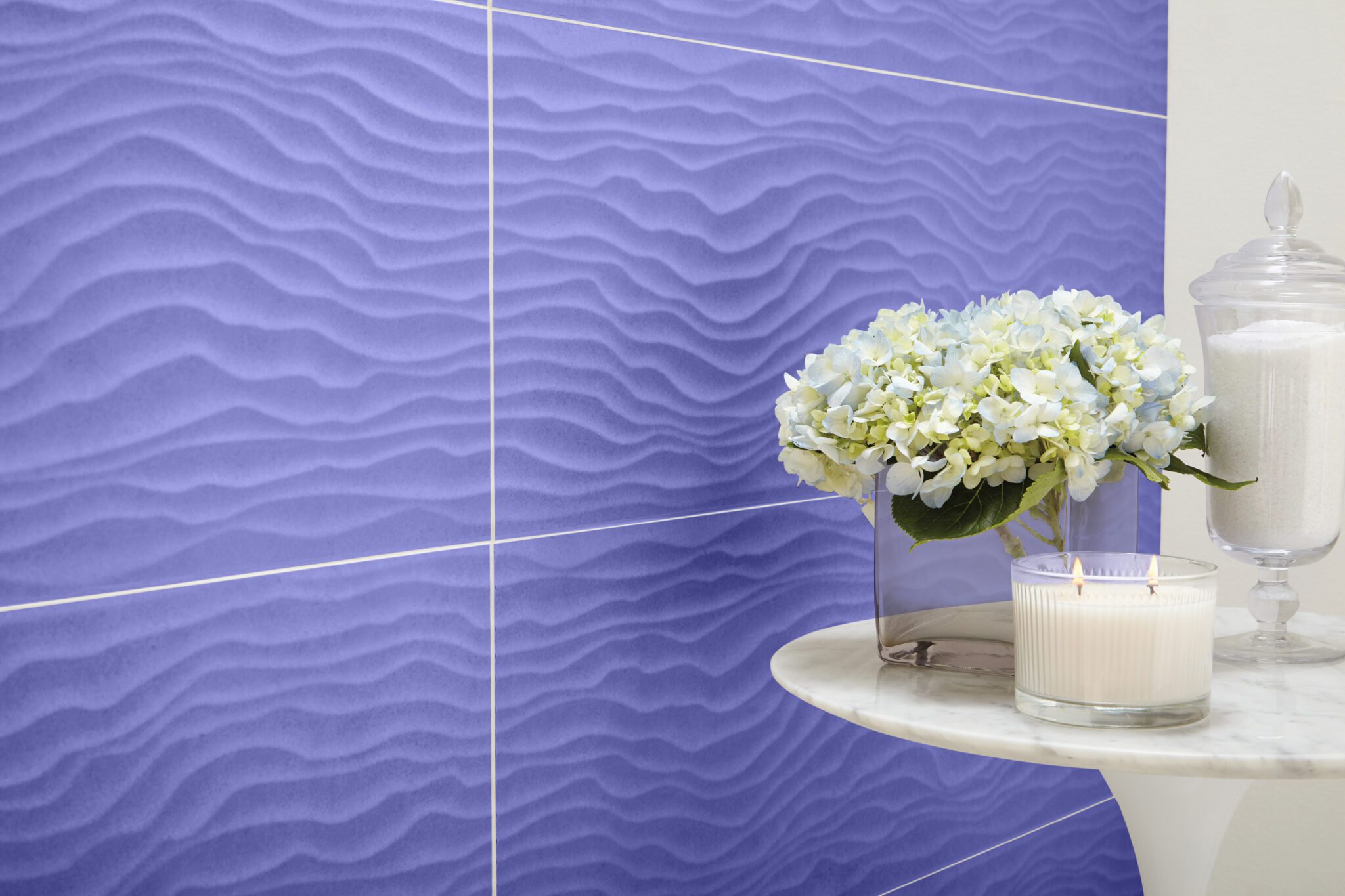
Colors that match our ideals promote positive moods and perceptions. This is what everyone hopes to achieve in their home, which is why we all wait breathlessly for the release of Pantone’s Color of the Year. This year’s color: Very Peri, a periwinkle purple with red undertones.
Very Peri is the first Pantone Color of the Year ever curated from scratch, rather than selected from a catalogue of thousands of hues. The shade promotes looking at the world “through different eyes” and inspiring “unexpected solutions to what we call daring minds,” according to Pantone’s executive director Leatrice Eiseman in an interview with The New York Times.
Very Peri is also aligned with modern tech sensibilities: there was even an NFT project that coordinated with its digital semblance and futuristic gaze.
So, what emotions does Veri Peri evoke and represent—and how can this be applied to interior design?
Let’s explore.
Variety is the Spice of Life
With design, color is the holy grail. We have seen its transformative power in real time and know how quickly it can set the tone of a room.
Veri Peri is an example of this emotive capriciousness.
While some designers praise its celestial and aquarian quality, others rebuke it for being perhaps too campy, too kitsch, cartoonish, and unsettling. For example, according to the New York Times article, Georgia Wilkinson, studio coordinator of Creed Design Associates in Leicester, England, criticized the color’s “brash and cartoonlike quality.”
However, when it comes to designing a home, color varies in an endless spectrum of tones, shades, pigments, and applications, so it’s important to experiment and test colors out for a cumulative period before jumping to conclusions.
For instance, you may glimpse the Veri Peri color as gorgeous and alluring at first glance. But after being exposed to the color over time, you may become uneasy or even anxious from its presence.
There’s your answer.
It’s time to choose another color and sit with that one.
Conversely, you may sit with the color and grow to love it more every day. Other designers have praised the color for its drama, with its blue hues signaling positivity. The designer India Mahdavi, known for her adventurous color choices, described Veri Peri as “the color of the sky between dusk and dawn,” and suggested using it as an accent – a velvet sofa, a tiled backsplash, one wall out of four in a room, a bathroom wallpaper, etc.
 Technology to the Rescue
ILG’s visualization technology can help homeowners determine which camp they are in, with Veri Peri or any hue. They can experiment with different colors and their subsequent emotions to determine if the color gives them what they need—be it a sense of joy and energy or a stabilizing calm or peace—and how it might be applied in their home.
Whether we know it or not, color has a polarizing effect on the psyche. We either respond to it well or we don’t. Veri Peri symbolizes how a bold color choice can provoke intense responses across the spectrum of human emotion.
For example, many people feel calmer with soft, brown tones. They value simplicity, remote work, movement, and meditation—a return to a more rustic vestige away from technology. Others are more daring and may be drawn to cheekier shades like Veri Peri. It all depends on personal preference.
When it comes to designing a home, the owner is empowered to choose, but it is wise to remind them of deep impact one color can have. That’s why ILG provides expert designer teams—among expert installation teams, to serve as a guide and ultimately make builders’ and buyers’ lives easier.